Book dust cover and first chapter redesign for 'The Virgin Suicides'. The Virgin Suicides is about a group of male friends who become obsessed with a group of mysterious sisters who are sheltered by their strict, religious parents after one of them commits suicide. They tell the story as the four other girls deaths follow and their confusion and the nonchalance of the community.
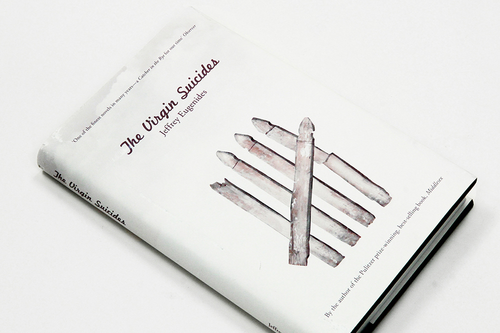
The cover art uses the white picket fence, a symbol of suburban happiness and contentment. However in this design the picket fence is run down and dirty and arranged like a tally chart, representing the 5 deaths of the 5 girls. This metaphorical juxtaposition represents the 1950s American Obsession with Happiness and the suburban ability to pretend everything is okay when it clearly isn’t. The subtle cloud background ties the whole cover art together and gives a whimsical, heavenly feel, representing the way these girls were regarded as almost angel-like and untouchable.
The cover art uses the white picket fence, a symbol of suburban happiness and contentment. However in this design the picket fence is run down and dirty and arranged like a tally chart, representing the 5 deaths of the 5 girls. This metaphorical juxtaposition represents the 1950s American Obsession with Happiness and the suburban ability to pretend everything is okay when it clearly isn’t. The subtle cloud background ties the whole cover art together and gives a whimsical, heavenly feel, representing the way these girls were regarded as almost angel-like and untouchable.
The text design was aimed to look clean and simple, further enhancing the angel-like, whimsical feeling of the book. A clear, unobtrusive layout was designed for the body copy and accompanying pages. The text is readable and has clear, effective hierarchy. The margins are breezy without being inappropriate for a book. . The copyright information, running headers, and page numbers are slightly smaller than the 11 pt copy to allow for ease of understanding due to hierarchy. The half cover, full cover, chapten name, etc all apply a rough rule of thirds, beginning a the same height on each page, ensuring cohesion. The typeface used was Adobe Garamond Pro, which after research was determined to be a commonly used and effective body copy typeface. It has a timeless look and is not to sharp and strong, so works perfectly with the 1950s setting and the whimsical mood aimed for with the design. The dust cover also uses Adobe Garamond Pro, which ensures maximum cohesion. For the heading and author name it uses Marketing Script, which has a retro 1950s/60s feel, fitting well with the setting of the novel. It has slight curves, but enough strength to ground the design and give it some structure.